
Why pick Craig’s List for a UX Redesign?
We all know Craigslist! Purple type and long lists. But you find cool stuff.
As part of the UX Design program at UC San Diego, I chose to focus on Craig’s List for my class project. Known for its simplicity and no-frills interface, Craigslist remains a popular platform with over 250.6 million monthly visitors (as of March 2022). Despite this massive traffic, the site has long been criticized for its outdated design and user experience issues.
While many users continue to rely on Craigslist, there’s been increasing discussion online about its decline, with some experts arguing that the platform could face challenges in the future if its user experience isn’t modernized. Through user research and feedback, I identified several pain points that could be addressed to improve the site. Based on these findings, I proposed a redesign that focuses on four key areas where improvements could help enhance usability, increase user engagement, and keep the platform competitive in a rapidly evolving online marketplace.
This project was an opportunity to apply UX research and design principles to a real-world platform, with the goal of making Craigslist more intuitive and user-friendly for its millions of users.


Redesigned Solutions for Craigslist
Below are the improvements I’ve implemented to address some of the key challenges that Craigslist currently faces:
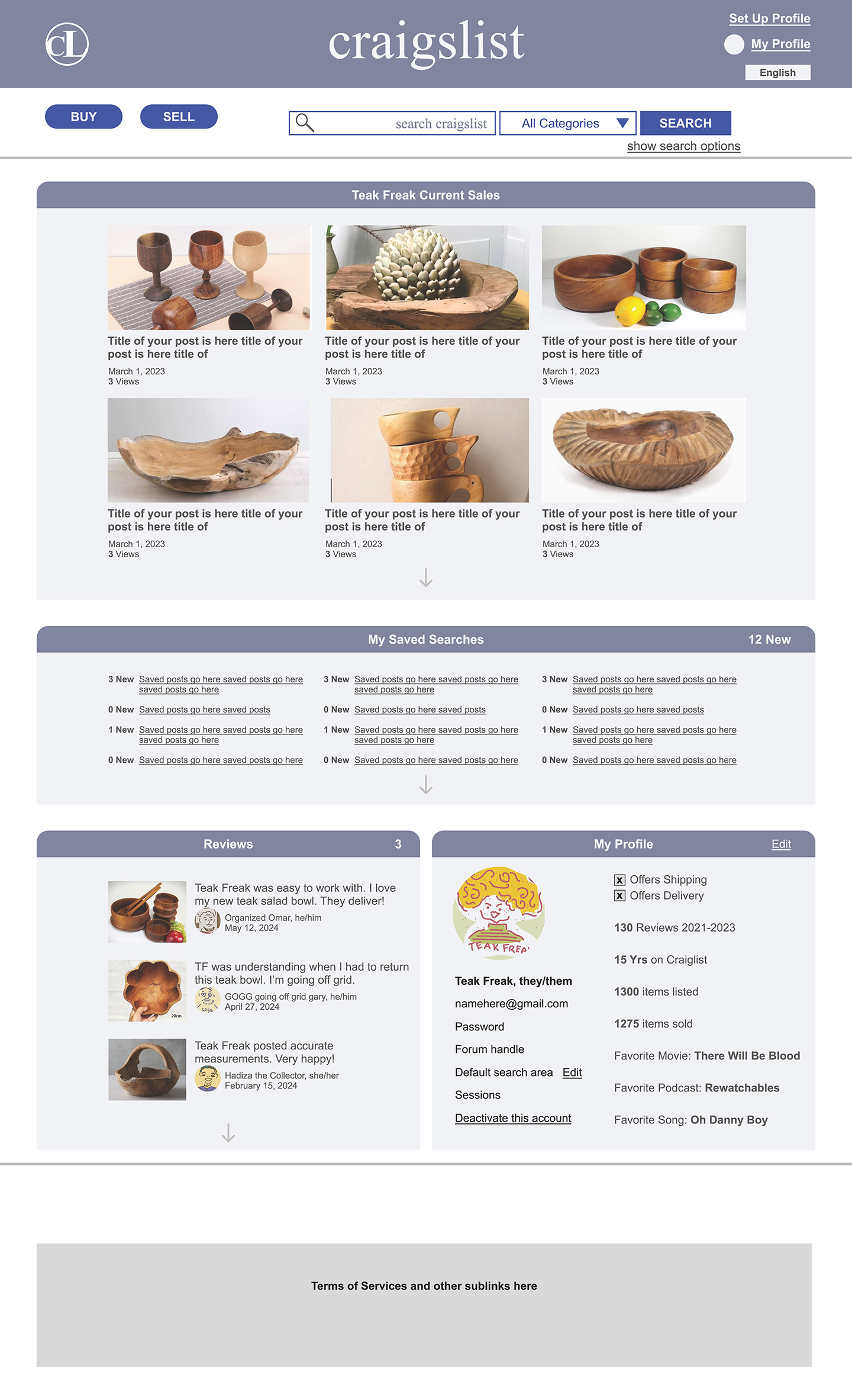
1. Cleaned-Up Aesthetic, Retaining the Core Brand
Craigslist's brand is undeniably strong and easily recognizable, especially with its signature purple letters. However, the site often feels chaotic, like a cluttered garage sale. While some users appreciate the rawness of this look, others prefer a cleaner, more organized experience. To balance these two needs, I've given the design a fresh, tidier look while still retaining some of the original purple elements for brand consistency. I also conducted an ADA (Americans with Disabilities Act) color accessibility study and found that the purple typography doesn't meet accessibility standards in some areas. To address this, I’ve used bolder, larger purple text (at least 18.5pt) where necessary, and in other places, I’ve switched to a soft, deep gray to ensure readability for all users.
2. Improved Search Navigation
The original side navigation menu has been removed in favor of a more streamlined top navigation bar. This change makes it easier for users to find their way around the site without feeling overwhelmed by unnecessary options. Additionally, I’ve added helpful search prompts, especially for first-time Craigslist users. These prompts guide people to refine their searches, making the process faster and more intuitive.
3. Enhanced User Profiles and Seller Dashboards
Currently, Craigslist users can save basic information such as their zip code and past purchases, but there’s little incentive to build a more complete profile. My redesign introduces a simple, optional user profile. This profile includes a few fun, lighthearted questions and offers quirky, anonymous avatar options. For sellers, I’ve created a dashboard where they can track their activity and receive reviews from buyers. This not only adds credibility but also builds trust within the community. The profile is optional to maintain Craigslist’s simplicity, but users can choose to engage with it for a more personalized experience. Additionally, users can choose to interact exclusively with those who have profiles, ensuring a higher level of accountability on both ends.
4. Shipping Option for Sellers
To expand Craigslist’s reach, I’ve added an easy-to-use shipping option. This allows sellers to offer shipping as a delivery method, which opens up the possibility of selling to a wider audience, even outside of local markets. The shipping option doesn’t need to include complex features like postage or tracking info—just the basic ability to select shipping as an option will suffice. This simple addition can significantly improve the user experience, especially since Craigslist operates across 700 cities and 70 countries, allowing sellers to expand their market potential.
Conclusion
The proposed redesign maintains Craigslist’s core values—simplicity and directness—while making the site more accessible, functional, and user-friendly. By refining the visual design, simplifying navigation, adding user profiles and seller dashboards, and introducing a shipping option, the site can attract a broader audience without sacrificing its unique charm. The goal is to make Craigslist an even more trusted and efficient marketplace while preserving the community-oriented, no-frills vibe that users love.